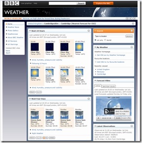
Some months ago, the BBC decided they would update their weather website to look more ‘modern’. I must say, the design was slightly dated but a user could access ALL information required very easily. 24 hour forecast, with temperature, wind, humidity, pollen etc at a click of a button. Users could even get a nice five day at a click of a button.
Now, we are presented with this. (Click to view larger)
 I really wish I had a screen shot of the old layout, because I thought it was a lot better. Now, I don’t know if I’m being stupid, but I find it really annoying and un-intuitive navigating this website. So much so I’ve been sent elsewhere, namely “weather.co.uk”, the Weather Channels UK website.
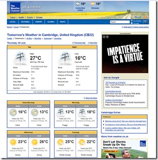
Now, I have this…
 Look at that! Type in postcode (which BBC didn’t recognise even though the code change has been in place for at least a year or more!) and its away. Click “tomorrow” and oh yeah, we have tomorrows weather and a very nice organised breakdown.
Its exactly what I want from a weather report, instantly I can see its going to be warm again!
If you want to see for yourself, go to:
Please comment if you feel the same way! I have emailed feedback to the BBC about this design change and got no reply!